- Z-POSTS (21)
- Z-NOTES
- Z-EVENTS
- DESCRIPTION
- Item 1
19 Data management
Add Z-POSTZ-POSTS is a public space. The content written here will be visible to the ZVENIA community.
 ZVENIA Mining .29/04/2024
Is dashboard UI taking a backseat in your company?
This could lead to a poor user experience.In the guide below, I present some simple techniques to ensure you get the basics right for the core UI of dashboards:
👉 Filter pane functionalities and options
👉 Navigation pane layout and structure
👉 Using guidelines and annotationsBy following these simple tricks, you will prevent your users from becoming frustrated and wondering how the dashboard works.
Credits to Kobe Wastiels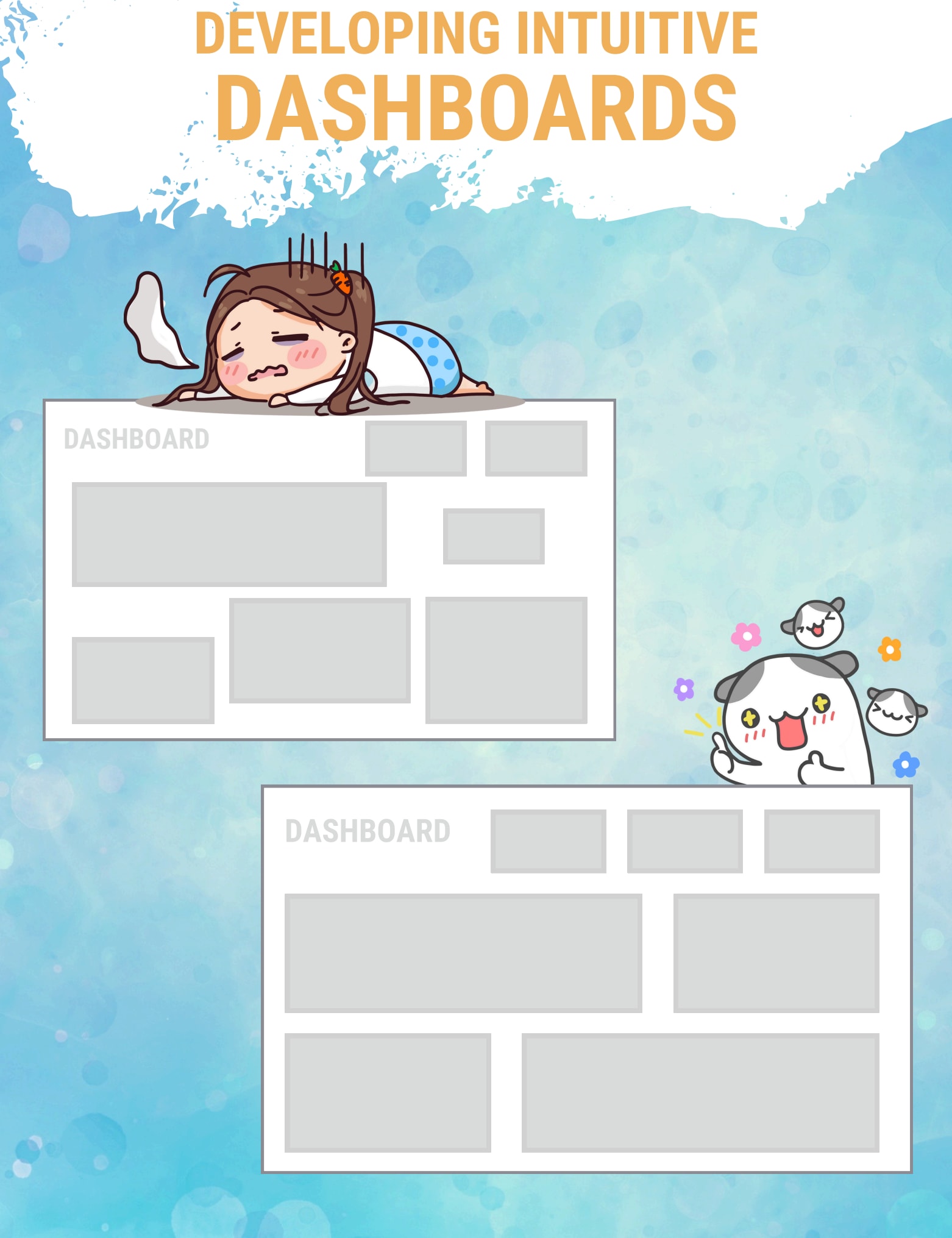 ZVENIA Mining .27/03/2024
Why is your company spending so much money on this dashboard if it’s going to be buried in the depths of a platform that’s too difficult for users to access?
This is one of the questions I ask Data Analysts when a dashboard should have been a success, but isn’t in the end.
How many actions does the user have to perform before reaching the dashboard?
You’ve never counted, have you?
And yet it takes an average of 17 clicks to reach the data.
Imagine having to press 17 different buttons to turn on your TV, start your car…
This is another UX flaw in the world of BI, and it’s also why Dataviz Clarity aims to bridge these two worlds.
Both can learn from each other and The Dashboard Assessment will be one of these bridges.
Source: Aurélien Vautier
Credits to Aurélien Vautier ZVENIA Mining .27/03/2024
Source: MLTUT
Credits to Reza Bagheri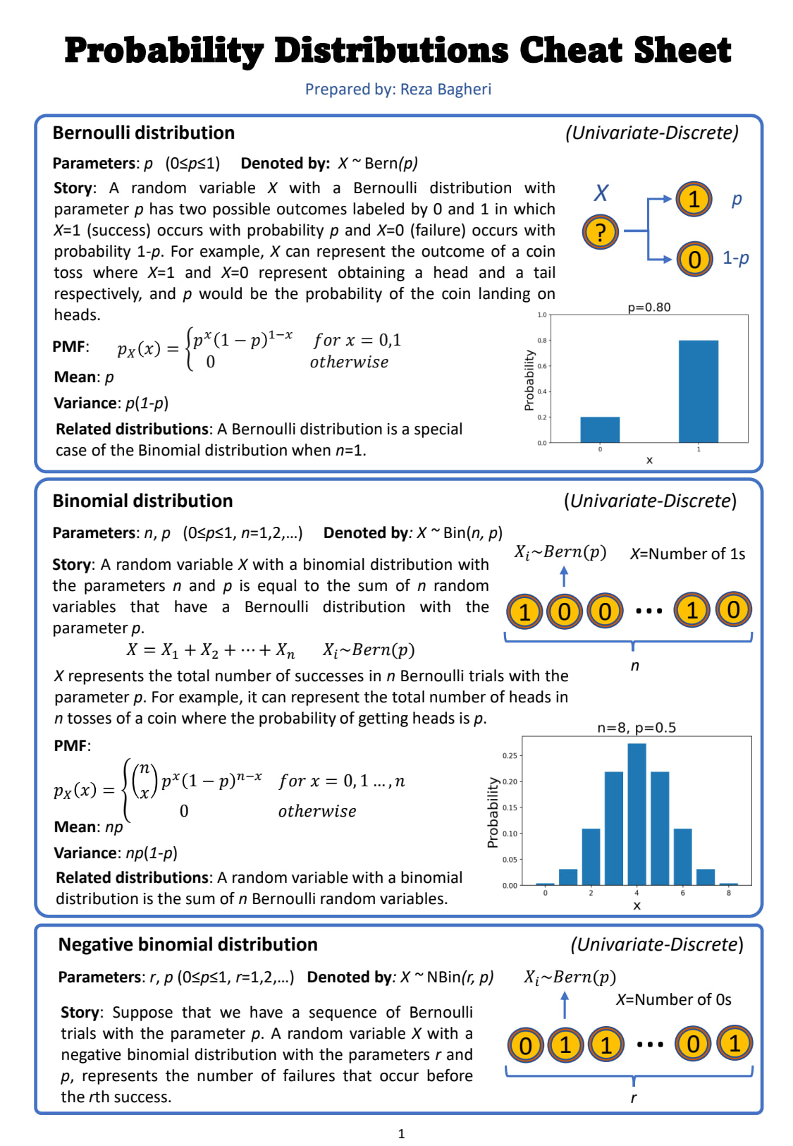 ZVENIA Mining .27/03/2024
A Dashboard Designer’s worst nightmare is to have their dashboard criticized. Or worse..
To have their skills questioned.
There are so many things that can go wrong when developing dashboards.
These can include:
– A limited understanding of the data.
– An inability to access users
– A pressure from management
– The wrong tools stack
– A lack of resources
– A lack of method
– A lack of training
– A lack of time
– And moreAnd 90% of the time, when a project or dashboard fails, it’s one or other of these two elements that suffers:
– The tool
– The developersA tool can be changed.
But when it’s the teams that suffer, it can cause a loss of credibility and confidence, and lead to tensions or people leaving.
It’s unfair.
Most if the time, there’s just one brick missing between the audience, the ambitions and the plan.
Over the last few months, I’ve been working on the dashboard assessment checklist, which aims to close this gap.
It’s such a simple product that all you need is a pencil and a single sheet of paper.
Inside, I’ve concentrated several years’ experience in observing what goes wrong in dashboarding projects.
With the checklist and the ready-to-draw diagrams, in just a few minutes you’ll be able to visualize the ‘identity card’ of your dashboard, as well as its strengths and weaknesses.
This simple page linked to a dashboard will enable you to :
– Structure the project
– Identify the audience
– Identify the complexity of the data
– Identify the purpose of the dashboard
– Assess whether your developments comply with best practice
– And visualize inconsistencies between assessment componentsFor instance, once the assessment is complete, you will easily be able to see anomalies such as :
– A massive volume of data + an extra-granular level of detail + several years of data history = excessive loading time and business trying to put everything in the same dashboard
– An exploratory dashboard + 4 different purposes = Scope is overly broad and an audience with limited data maturity.
I’m pretty sure you’ll be as excited to use it as I was to design it.
Source: Aurélien Vautier
Credits to Dataviz Clarity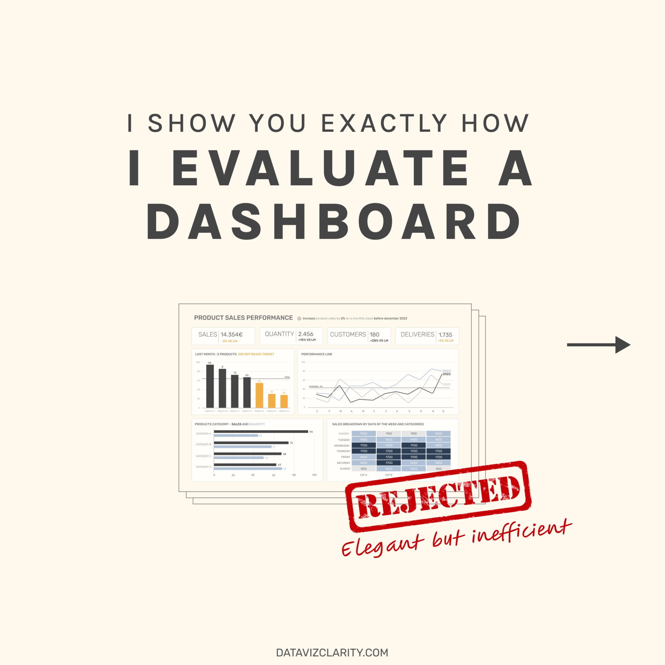 ZVENIA Mining .26/03/2024
Data visualizations are a vital component of a data analysis, as they have the ability to efficiently summarize large amounts of data through a graphical format. There are many chart types available, each with their own strengths and use cases. One of the trickiest parts of the analysis process is choosing the right way to represent your data using one of these visualizations.
When deciding on a chart type, first think about the type of role the chart will serve. Common roles for data visualization include:
• showing change over time
• showing a part-to-whole composition
• depicting flows and processes
• looking at how data is distributed
• comparing values between groups
• observing relationships between variables
• looking at geographical dataNext, consider the types of data you want to plot. The type of chart you use will depend on if the data is categorical, numeric, or some combina tion of both. Certain visualizations can also be used for multiple purposes depending on these factors. This book is organized with this approach in mind, with one chapter for each visualization role, each with multiple chart types to cover common types of data and subtasks.
Note that this document should only serve as a general guideline: it is pos sible that breaking out of the standard modes will help you gain additional insights. Experiment with not just different chart types, but also how the variables are encoded in each chart. It’s also good to keep in mind that you aren’t limited to showing everything in just one plot. It is often better to keep each individual plot as simple and clear as possible, and instead use multiple plots to make comparisons, show trends, and demonstrate rela tionships between multiple variable
Source: Aqsa Z
Credits to Chartio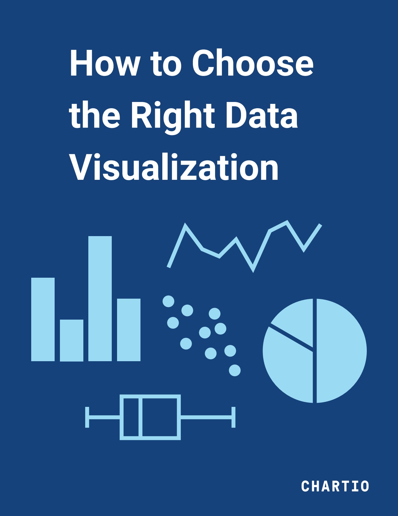 ZVENIA Mining .16/03/2024
Color matters and is especially helpful with your storytelling. It conveys more information than we might think in many cases and sometimes it also delivers emotion. But still, less is more, keep it simple unless necessary.
When I think about the charts that I made in the early days, yes, they did look like peacocks. 😂
One more book recommendation for data storytelling
https://lnkd.in/g5iTqjSHWhat did your first few charts look like? Were they very different from your current work?
Source: Warsaw University of Technology
Credits to Alex Wang ZVENIA Mining .30/11/2023
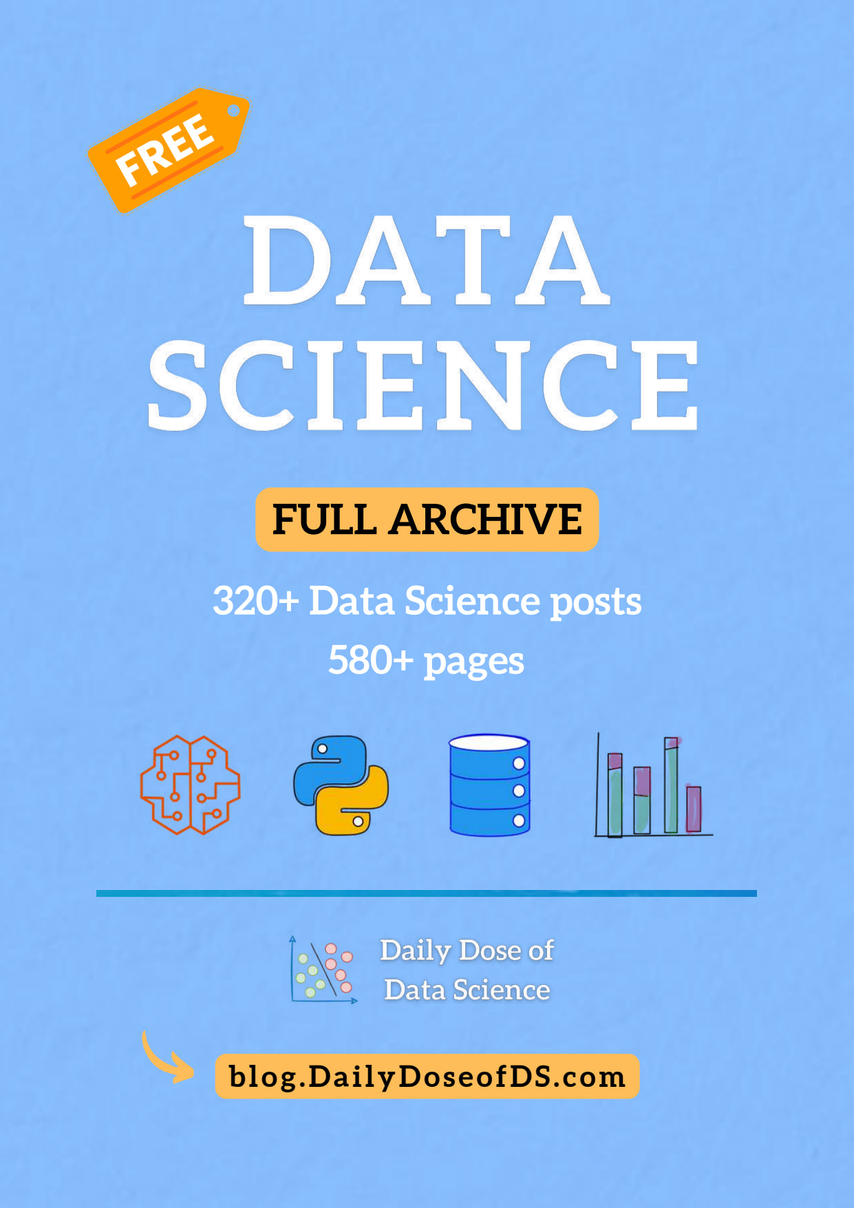
I decided to put together all my posts in a single PDF. It covers 320+ posts and has over 550 pages.
.
.
Background: I have been writing about Python and Data Science consistently for ~11 months now.When I started this newsletter 11 months back, I never expected it would turn out to be so rewarding and fulfilling. I am deeply grateful to everyone who loves reading my work.
The PDF covers posts about various topics such as Python, Pandas, Data Visualisation, Jupyter Tips, no-code tools, Optimization techniques, Statistics, ML fundamentals, and many more.
I hope this PDF will be helpful.
Source: Avi Chawla, LinkedIn
 ZVENIA Mining .16/10/2023
Comentario de Rosana Ferrero, PhD:
📚 Uno de mis libros favoritos, excelente para aquellos que buscan una introducción al #DataScience y #MachineLearning
👉 Aprende conceptos de manera clara y concisa, con ejemplos increíbles ZVENIA Mining .14/10/2023
From countless coaching sessions and trainings, I’ve gathered the Top 10 dashboard best practices every data professional should know.
I’m willing to share the high-resolution visual again, even if I probably sacrifice an evening or two again 😂
In this visual, you’ll find best practices about :
A – Using margins. Space in a dashboard is as good as silence in a conversation.
B – Using an easy-to-read font to improve usability and accessibility.
C – Reducing the clutter. The less, the better, always.
D – Using text size and style to catch the eye of users.
E – Picking the right chart for the right purpose.
F – Removing unnecessary elements to reduce clutter (again).
G – Following the Z pattern while building your dashboard (careful about cultural reading orientation).
H – Providing context for big numbers.
I – Grouping connected elements when there is a link between them.
J – Improving readability by rotating text and chart.Source: Aurélien Vautier, LinkedIn
 ZVENIA Mining .09/10/2023
Harnessing the power of spreadsheets to streamline data, analyze trends, and make informed decisions.
Let’s connect and discuss how Excel can drive efficiency in your projects!
Follow Dr.Vaishali Dixit for more contents..🤗
Credit:Towson University
 Juan Manuel Martinez caviedes05/10/2023
La Tecnología de Datos (DT) es crucial para las empresas, pero su verdadero valor radica en la toma de decisiones basadas en datos. La analítica avanzada desempeña un papel fundamental en este proceso, optimizando las operaciones comerciales y ofreciendo ventajas competitivas. Además, la colaboración entre analistas de negocios y científicos de datos es esencial. La preparación de datos y el uso de tecnologías avanzadas son clave para lograr el éxito en este campo.
1. **Tecnología de Datos (DT)**
– Importante para las empresas
– Valor en la toma de decisiones basadas en datos2. **Analítica Avanzada**
– Categorización, regresión, etc.
– Eliminar diferencia entre procesos y datos
– Ventajas competitivas3. **Colaboración entre Analistas**
– Roles tradicionales cambian
– Aprendizaje digital
– Competencias multidisciplinarias4. **Proceso de Análisis**
– Iterativo y escalable
– Preparación de datos
– Diversas técnicas de análisis5. **Tecnología en Analítica Avanzada**
– Código abierto y propietario
– Software como Servicio (SAAS)
– Flexibilidad, escalabilidad
– Lenguajes de programación (R, Python, etc.) ZVENIA Mining .05/10/2023
Getting Started with Excel Charts
The terms chart and graph are often used interchangeably but do have one significant difference
A chart is a graphic representation of data.
A graph is a diagram of a mathematical function, but can also be used (loosely) about a diagram of statistical data.Course objectives:
• Distinguish between Charts and Graphs
• Creating a basic chart and template
• Format and configure chart output
• Represent Time, Frequency and Proportions
• Combining ChartsSource: UQ Library
Dr.Vaishali Dixit. LinkedIn ZVENIA Mining .28/09/2023
Thanks to Aurélien Vautier for sharing with us this interesting cheatshee.
As Aurélien said:It took me 3 years to figure it out.
I wasted time, energy and It was a lot of frustration.Terminology chaos is a disaster for your business.
Is it a measure, a metric or a KPI ?The choice and weight of the words and acronyms we use every day must be incredibly precise.
We can’t afford to use vague terminology when talking about development projects or dashboard migrations.
To be honest, until very recently, I used to mix up certain terms, which sometimes made communication comical or even frustrating.
This cheatsheet contains clarification about the following terms :
A : Data Story Framing and Data Story Telling.
B : Measure, Metric and KPI.
C : Bar Chart, Histogram.
D : Reporting, Analysis report, Dashboard.
E : Chart, Graph, Plot, Diagram.
F : UX Design, UI Design.
G : Design Process, Design System.
H : Aggregation, Granularity.Which one is clearer to you now ? I’ve struggled a lot with B, E and F.
If you’ve learned something, share, like or tag someone who needs to see it. Each illustration can take up to 15 hours to complete. I really appreciate your support.
Thank you very much for the inspiration Brent Dykes (A) and The Interaction Design Foundation (F).
Some of them are an interpretation of my own experience.
For the high resolution image, please follow and DM me, I’ll be happy to share it with you.
Source: Aurélien Vautier, LinkedIn
 Juan Manuel Martinez caviedes25/09/2023
La Internet de las Cosas (IoT) está transformando la industria minera al conectar dispositivos físicos y proporcionar datos valiosos para la toma de decisiones. La gestión de datos eficiente es esencial, y la ciberseguridad es crucial debido a la rápida adopción de dispositivos IoT. La integración de tecnologías OT e IT está optimizando las operaciones mineras, mientras que los Centros de Operaciones Remotas (ROCs) mejoran la seguridad y la eficiencia. Las comunicaciones inalámbricas en entornos remotos son un desafío, pero es esencial para la minería moderna.
1. **IoT en Minería**
– Transformación de la industria
– Conexión de dispositivos físicos
– Datos para decisiones2. **Gestión de Datos**
– Organización y almacenamiento
– Análisis empresarial
– Importancia de la eficiencia3. **Ciberseguridad**
– Riesgos con la adopción de IoT
– Necesidad de protección
– Desafíos con servicios en la nube4. **Integración OT e IT**
– Optimización de operaciones
– Escalabilidad crucial
– Rol de las APIs5. **Centros de Operaciones Remotas (ROCs)**
– Herramientas esenciales
– Visualización de datos
– Mejora de la seguridad y eficiencia6. **Comunicaciones Inalámbricas en Minería**
– Desafíos en entornos remotos
– Necesidad de sistemas de cable adaptables
– Riesgos de ciberseguridad crecientes Juan Manuel Martinez caviedes22/09/2023
La industria minera enfrenta un desafío y una oportunidad en el uso de datos masivos (big data) para mejorar la eficiencia y la toma de decisiones. La Tecnología de la Información (TI) y la Tecnología de Operaciones (TO) se están fusionando, y esta colaboración está mejorando la relación entre ambas. Las nuevas fuentes de datos, como drones y sensores, están revolucionando la recopilación de información en la minería.
– Desafío y Oportunidad en la Minería
– Uso de big data para mejorar
– Fusión de TI y TO
– Big Data en la Minería
– Variedad, velocidad, volumen, precisión
– Datos estructurados y no estructurados
– TI vs. TO
– TI: Tecnología informática, redes, software
– TO: Control de objetos físicos, procesos
– Tecnologías Digitales (TD)
– Fusión de TO y TI
– Minimización de riesgos
– Nuevas Fuentes de Datos
– Drones, sensores, metadatos
– Mayor calidad y cantidad de información
– Resultados Positivos
– Mejora en la relación TO-TI
– Mayor eficiencia y confiabilidad
– Futuro Prometedor
– Mayor acceso a información
– Mejoras en la minería con tecnologías emergentes. Juan Manuel Martinez caviedes21/09/2023
La industria minera se encuentra en una encrucijada donde la Transformación Digital (TD) se presenta como una necesidad imperativa. Aunque algunos avances se están realizando, la mayoría de las empresas mineras aún están rezagadas en términos de adopción de TD. La seguridad, productividad y eficiencia son áreas clave donde la TD podría marcar la diferencia.
Las estadísticas revelan que solo una minoría de las principales empresas mineras han abordado adecuadamente la TD en sus políticas y han logrado medir los beneficios cuantitativamente. Sin embargo, hay un cambio en curso, y cada vez más empresas mineras están implementando con éxito planes de TD.
A pesar de estos avances, se enfrentan desafíos importantes, como la falta de empleados con habilidades digitales necesarias y la necesidad de comprender mejor cómo implementar eficazmente la TD. Además, la ciberseguridad está emergiendo como una preocupación crítica en esta transición.
En términos generales, la TD es un camino que la industria minera debe abrazar para mejorar su eficiencia y competitividad. La mayoría de las empresas ya tienen iniciativas de TD en sus planes a largo plazo, y se espera que esto conduzca a mejoras significativas en la efectividad de sus operaciones. Sin embargo, es fundamental superar los obstáculos que impiden una adopción más generalizada de la TD en la industria minera.
Cuadro Sinóptico:
I. La Necesidad de la Transformación Digital (TD) en la Industria Minera
A. Mejora de la seguridad, productividad y eficiencia
B. Rezago en comparación con otras industrias
C. Cambio en curso hacia la TDII. Estado Actual de la TD en la Industria Minera
A. Pocas empresas han adoptado la TD en sus políticas
B. Limitada medición cuantitativa de los beneficios
C. Cambio en la tendencia hacia una mayor implementación de TDIII. Desafíos en la Adopción de la TD
A. Falta de empleados con habilidades digitales
B. Necesidad de comprender mejor la implementación efectiva de la TD
C. Preocupaciones de ciberseguridadIV. Perspectivas Futuras
A. Más empresas incorporando la TD en sus planes a largo plazo
B. Mejora en la efectividad de las operaciones
C. Necesidad de superar obstáculos para una adopción más amplia de la TD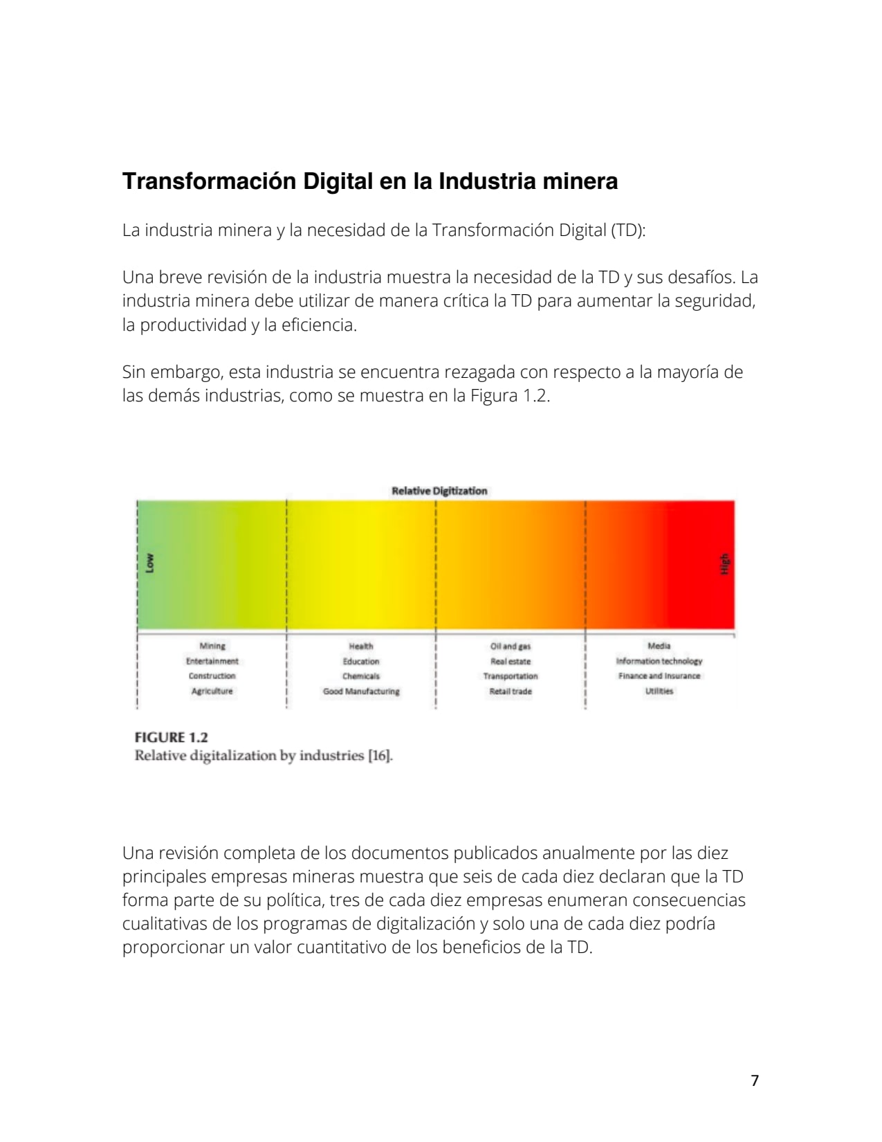 Juan Manuel Martinez caviedes20/09/2023
La transformación digital (TD) es esencial en la industria minera para mantenerse competitiva en un mundo cada vez más conectado. La TD impulsa la eficiencia, la toma de decisiones y la satisfacción del cliente. Las empresas deben invertir en casos de uso específicos, adoptar un enfoque multidisciplinario y aprovechar las oportunidades de bajo costo para desarrollar una cultura digital sólida. En un entorno donde la demanda y la oferta cambian rápidamente, la TD es la clave para el éxito futuro de la industria minera.
La transformación digital en la industria minera, no solo mejora la eficiencia y la toma de decisiones, sino que también tiene un impacto ambiental positivo al permitir una gestión más precisa de los recursos naturales y una reducción de residuos. La TD es esencial para una minería sostenible y responsable, y las empresas deben actuar ahora para mantenerse al día con esta revolución digital y proteger nuestro entorno. ¡El futuro de la minería y del planeta depende de ello!
Tema: Adaptación de la industria minera a los cambios tecnológicos
– Teoría sociotécnica en la minería australiana
– Transición exitosa de métodos manuales a alto rendimiento– Cuarta revolución industrial y era digital
– Recopilación masiva de datos en la minería– Componentes principales de la transformación digital (TD)
– Datos
– Conectividad
– Toma de decisiones– Impacto de la TD en la minería
– Aumento de capacidades digitales
– Mejora en eficiencia operativa y mantenimiento– Desafíos en la implementación de la TD
– Técnicos
– De gestión– Presión para adoptar tecnologías digitales
– Demandantes más conectados
– Consumidores centrados en experiencia del usuario
– Rápida adopción de nuevas tecnologías– Factores en la oferta
– Desagregación de procesos
– Reducción de costos tecnológicos
– Crecimiento de nuevos competidores– Estrategia de TD
– Transformación digital de negocios
– Transformación digital de clientes
– Transformación digital de la empresa
– Automatización y uso de tecnologías como IoT, robótica e IA– Recomendaciones para el éxito en la implementación de TD
– Definición de responsabilidades claras
– Inversión en casos de uso
– Acciones basadas en resultados
– Colaboración multidisciplinaria ZVENIA Mining .11/08/2023
How to analyze data?
Analyzing data can be a tedious and time-consuming task. Also, there is no one right answer to this question.
Depending on the purpose and the goal of the analysis. There are different ways to do this.1⃣ Drill Up and Drill Down
We can drill down and drill up to explore different aspects of business and move between levels of information.
✳️Drilling Down is the ability to move into further details from parent to child relationships to uncover root causes of anomalies.
✳️Drilling up is the move up from child to parent to look at the overall biggest picture or to move back and forth to drill up and down.2⃣ Slicing and Dicing
Slicing and dicing refers to the ability to pivot the dimensions of the data on-the-fly.
Large blocks of data are cut into smaller segments and the process is repeated until the correct level of detail is achieved for proper analysis. It presents the data in new and diverse perspectives and provides a closer view of it for analysis.3⃣ Segmentation
Grouping data with common attributes is especially useful for things like customer segmentation by customer type (e.g., small business, enterprise business, government).4⃣ Data Visualization
Data visualization is the graphical representation of information and data. By using visual elements like charts, graphs, and maps. There are many data visualization tools that provide an accessible way to see and understand trends, outliers, and patterns in data.5⃣ Driver Based Relationships
Dependency relationships (when one thing happens or changes, another thing happens or changes—in the same direction, or the opposite direction). Clustering relationships (uncovering independent relationships)6⃣ Benchmarking
It is comparing results with internal benchmarks (those produced by other lines of business within your company). Or external benchmarks (those produced by peers in your industry).
External Benchmarking is a process where you measure our company’s success against other similar companies. To discover if there is a gap in performance that can be closed by improving our performance. Studying other companies can highlight what it takes to enhance our company’s efficiency and become a bigger player in our industry.7⃣ Seasonality
presence of variations which occur at certain regular intervals, either on a weekly basis, monthly basis, or even quarterly. Various factors may cause seasonality – like vacati…Source: Asif Masani, LinkedIn
www.fpnaprofessionals.teachable.com ZVENIA Mining .01/08/2023
Table of Contents
1. SUM of Digits when cell Contains all Numbers
2. SUM of Digits when cell Contains Numbers and non Numbers both
3. A List is Unique or Not (Whether it has duplicates)
4. Count No. of Unique Values
5. Count No. of Unique Values Conditionally
6. Generate Sequential Weekday names like Sun, Mon, Tue, …..,Sat
7. Generate Sequential Month names like Jan, Feb, Mar….Dec
8. Find Last Day of the Month
9. Number of Days in a Month
10. Find First Day of the Month
11. Add Month to or Subtract Month from a Given Date
12. Add Year to or Subtract Year from a Given Date
13. Convert a Number to a Month Name
14. Convert a Month Name to Number
15. Convert a Number to Weekday Name
16. Convert a Weekday Name to Number
17. Financial Year Formula (e.g. 2015-16 or FY16)
18. Converting Date to a Calendar Quarter
19. Converting Date to a Indian Financial Year QuarterSource: Vijay A. Verma
Kasra Jadid Haghighi, LinkedIn ZVENIA Mining .24/07/2023
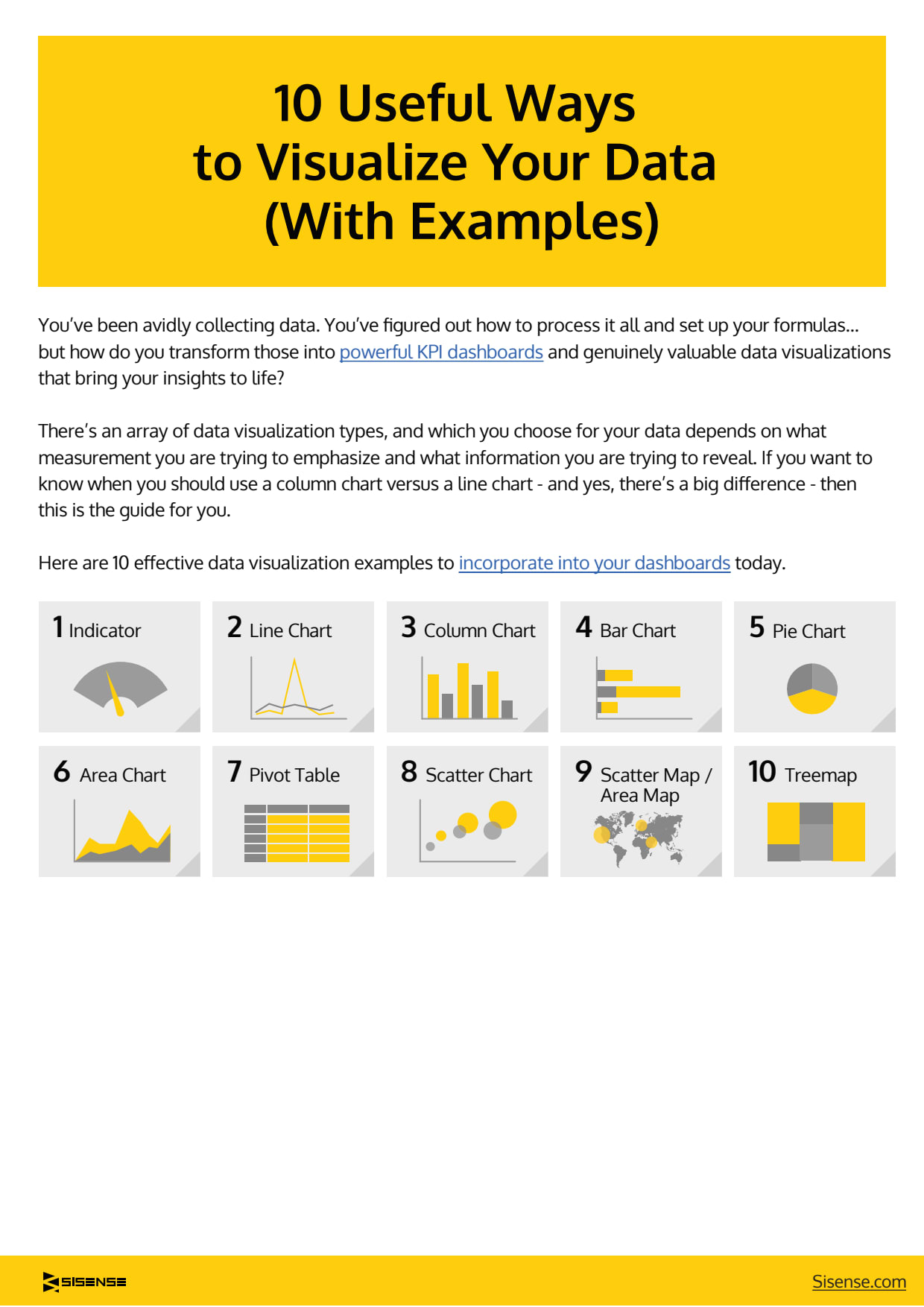
You’ve been avidly collecting data. You’ve figured out how to process it all and set up your formulas… but how do you transform those into powerful KPI dashboards and genuinely valuable data visualizations that bring your insights to life?
There’s an array of data visualization types, and which you choose for your data depends on what measurement you are trying to emphasize and what information you are trying to reveal. If you want to know when you should use a column chart versus a line chart – and yes, there’s a big difference – then this is the guide for you.
Here are 10 effective data visualization examples to incorporate into your dashboards today.
Source: www.sisense.com
 Juan Carlos OSORIO22/07/2023
This guide helps you choose the perfect chart for your data visualization needs. From simple charts to more complex, it takes you step by step. Whether you have one variable or many, ordered or not, this tool makes your data tell a clear story that everyone can easily follow.
Source: Faezeh Maghsoodifar, Linkedin

- Item 2
19 Data management
Add Z-NOTEZ-NOTES is a private space. The content written here will be visible only to you.
- Item 2
19 Data management
Add Z-EVENTZ-EVENTS is a public space. Events posted here will be visible to the ZVENIA community.
- Item 2
19 Data management
In this module you will have access to the following topics (not exhaustive) :
– Mining methods
– Statistics
– World consumption and production
– Use of minerals


